
Where I Get my Design Inspiration
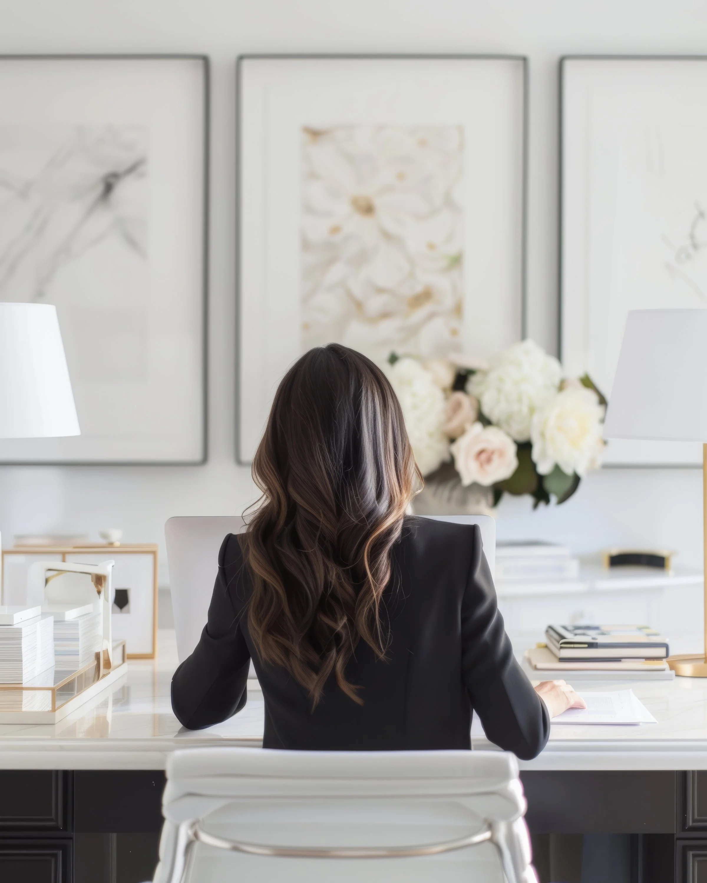
Walking past Liverpool’s sandstone terraces on a grey morning, I’m reminded why I love design that whispers rather than shouts.
As a website designer and developer obsessed with timeless, editorial aesthetics, I’m often asked: “Where do you find your design inspiration?” The short answer: everywhere. The long answer: I curate it with intention so my clients’ brands feel elegant, strategic, and uniquely theirs - not trend-chasing.
My inspiration philosophy
Function first, then beauty. If the experience isn’t effortless, it isn’t luxury. UX principles guide every creative decision.
Timeless over trendy. I draw from classic editorial design and refined typography so client sites age gracefully.
Real-world references. I look beyond screens to avoid derivative digital sameness.
1) Editorial design and print culture
Luxury lives in great editorial. I study magazines and books for rhythm, whitespace, and pacing - how a story unfolds across spreads. Think generous margins, quiet typography, and confident grids. These choices translate into websites that feel calm, premium, and considered.
What I look for: type pairings, column systems, pull quotes, image hierarchy, and how text breathes.
How it shows up on sites: measured line lengths, one clear focal point per section, and layouts that invite slow, intentional browsing.
2) Architecture, interiors, and materiality
Stone, brass, linen, glass—materials teach restraint. I photograph textures and notice how light interacts with surfaces. That sensitivity informs colour palettes, hover states, and micro-interactions that feel tactile and grounded. Liverpool’s mix of Georgian symmetry and waterfront minimalism often shapes my palettes and spatial rhythm.
What I look for: proportion, negative space, sightlines, and how one room transitions to the next.
How it shows up on sites: structured sections, seamless transitions, and a sense of spatial flow from hero to footer.
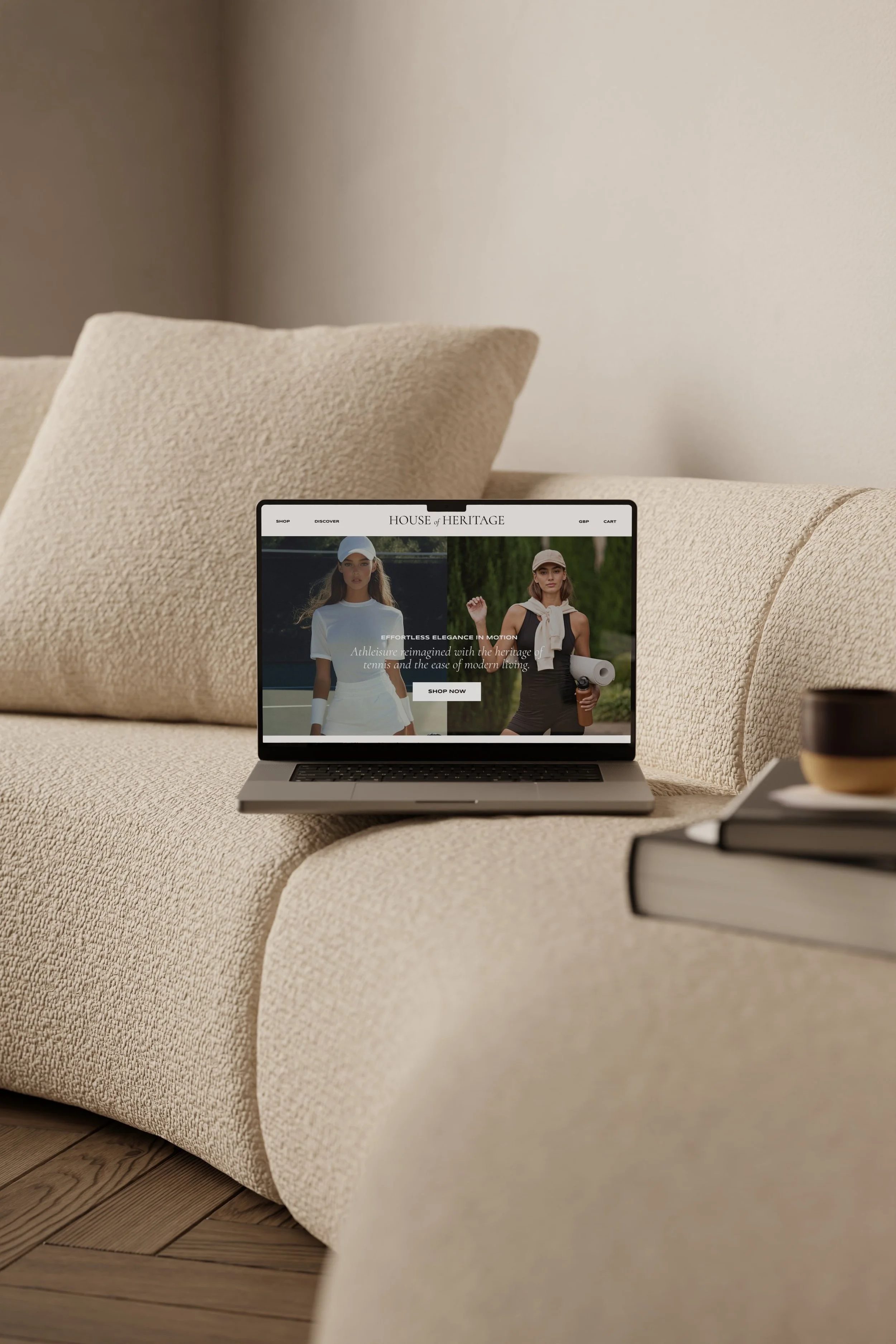
3) Fashion campaigns and brand storytelling
Luxury fashion understands narrative and restraint. I study campaign art direction - how a single image can hold a mood. This helps me design websites where imagery works harder, copy has room to breathe, and the brand’s voice feels self-assured.
What I look for: mood, pose, framing, repetition, and the power of negative space.
How it shows up on sites: elegant hero imagery, editorial headlines, and decisive use of whitespace.
4) Thoughtful digital craftsmanship
I’m trained in UX and build primarily on Squarespace with custom CSS/JS. I pull inspiration from small, purposeful interactions: a subtle scroll reveal, a pauseable animation, or a graceful accordion. Accessibility is non‑negotiable - contrast, readable type, and descriptive links are part of the aesthetic, not an afterthought.
5) The clients themselves
My best ideas come from listening. Every founder has phrases, stories, and quirks that signal design directions. I translate those into visual systems—type, colour, rhythm—so the brand feels like them, not me. For bridal studios, for instance, I might prioritise soft pacing and tactile typography; for photographers, bolder image-led grids.
What I listen for: values, pace, confidence level, and the experience they want their clients to have.
How it shows up on sites: copy-led layouts, refined imagery curation, and features that support how they actually work (bookings, shops, courses).
6) Quiet luxury online: curated references
I keep a living library of digital references - minimal, editorial websites, subtle motion studies, and best-in-class product storytelling. I’m selective: fewer, better references keep the work cohesive.
What I collect: typography specimens, grid studies, navigation patterns, refined Shopify and Squarespace builds.
Featured resource I trust: For those exploring refined digital craftsmanship, I recommend checking out DesignRush for lots of design insipiration!
