
Luxury BRIDAL BOUDOIR PHOTOGRAPHER BRAND DESIGN Case study
When a rebrand isn't about looking different - it's about becoming uncopyable

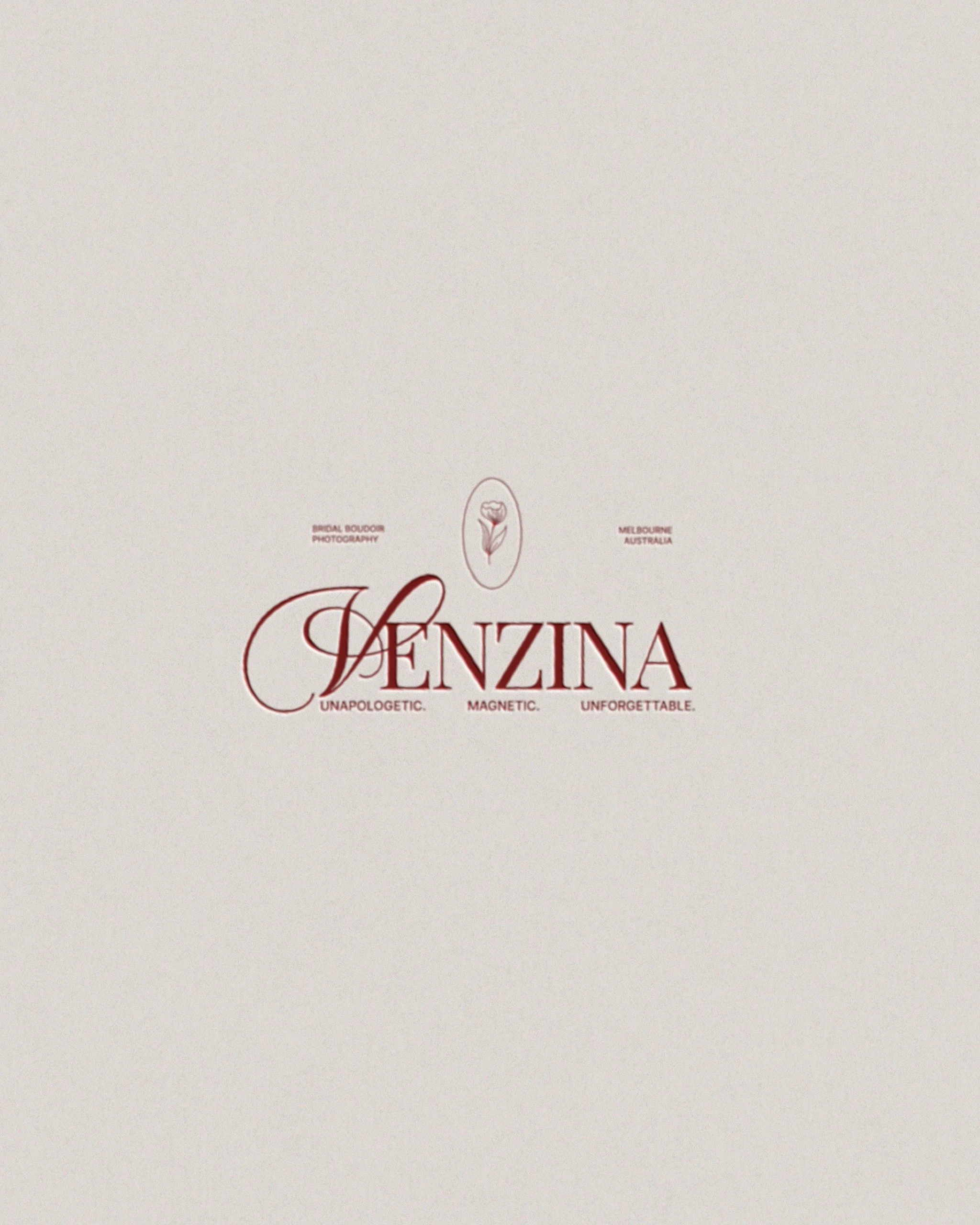
Client: VENZINA
Location: Melbourne, Australia
Category: Luxury Bridal Boudoir Photographer

The Problem
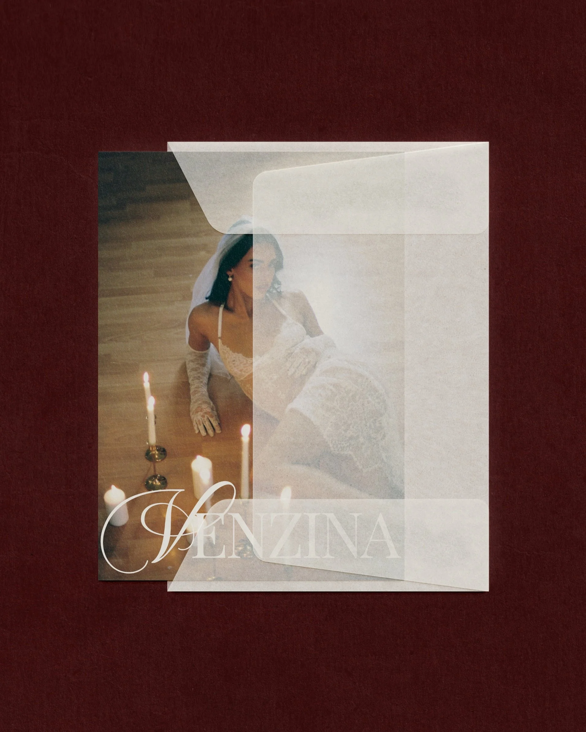
Boudoir photography has a brand problem. The category defaults to a certain visual language - dramatic lighting, script fonts, blush and cream - and most photographers within it look almost interchangeable.
When Viv came to me, she was ready to step into a more elevated, luxury positioning. She wasn't starting from zero, and she had a clear vision of what she wanted her work to feel like.
What she needed was a brand that matched that ambition - and a strategic foundation that would make her instantly recognisable as operating at a different tier entirely.
"Editorial, luxurious, feminine" are words almost every luxury photographer uses. The job wasn't to make those words look nice. It was to make them mean something specific to Viv - and feel impossible to replicate.

The Thinking
Before we touched a single design decision, we worked through the strategic foundation: who Viv's ideal client actually is, what she needs to feel before she'll book a luxury boudoir experience, and what VENZINA needed to communicate in the first three seconds of contact.
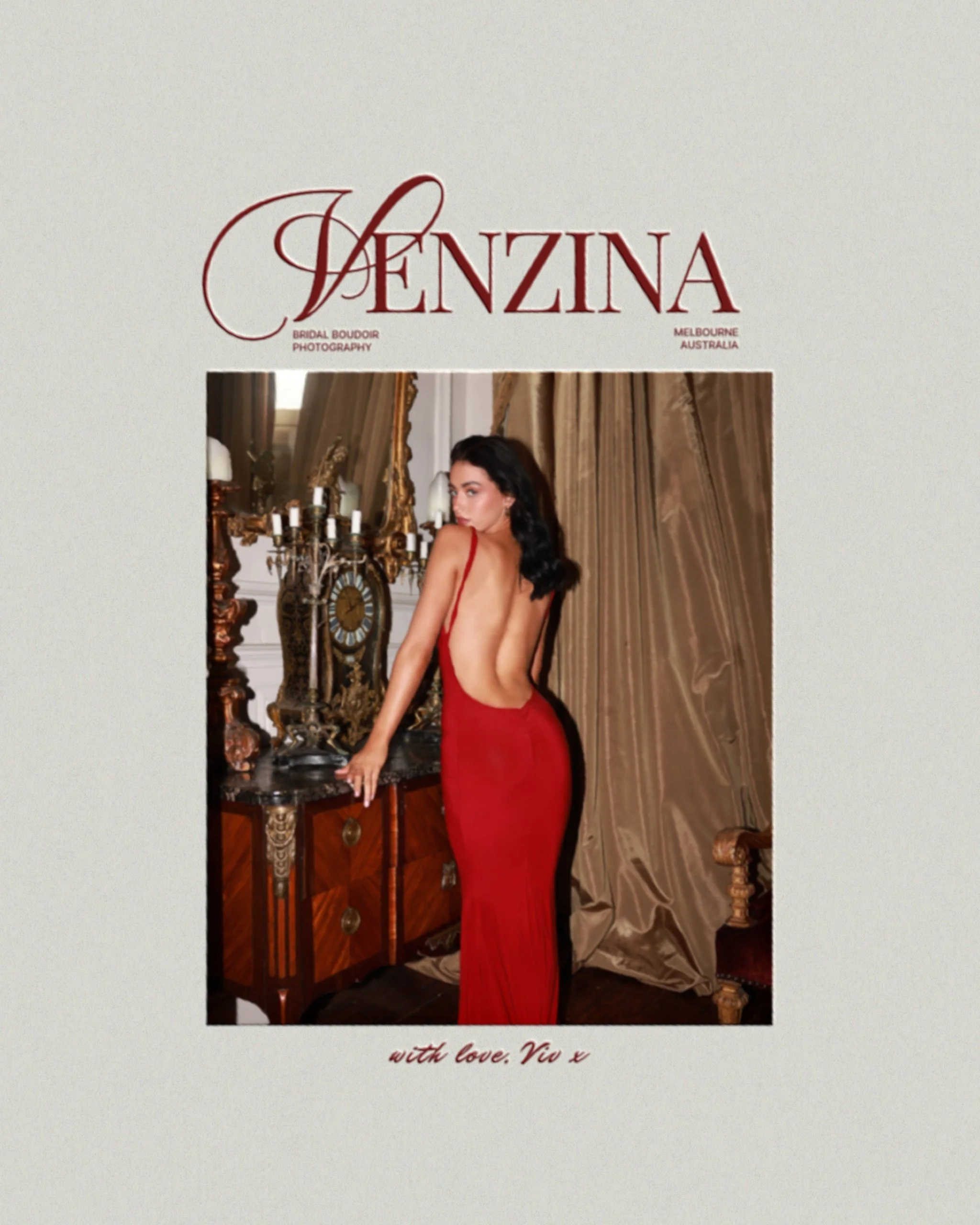
The brief that emerged was precise: a brand that feels like editorial high art — not sexy-adjacent, but genuinely, unapologetically confident in its own luxury. The kind of brand a woman sees and thinks that's exactly what I want before she's even consciously decided to enquire.
01
The Name as Foundation
VENZINA draws from Venus - goddess of beauty, love, and feminine power. It gave the brand a mythological lineage without being literal. A name that holds meaning without explaining itself.
02
Typography for Cultural Authority
The serif was chosen for its Vogue-esque editorial quality and because it signals a world. Paired with a script V, it earns femininity without softening the authority.
03
The Rose as a Symbol
The framed rose illustration gives VENZINA a visual icon she can own across every touchpoint. The oval frame — a vintage hand mirror — is itself a Venus symbol. Every detail earns its place.
What it was built to do
The brand was designed with a specific client journey in mind: a woman who's been thinking about a boudoir experience for a while, who has encountered other photographers and felt something was slightly off — too cheap-feeling, or too overtly sexual, or just not quite her. VENZINA is built to be the one she finds and immediately knows is different.
Attract without explaining
The visual world communicates luxury tier before a word is read — removing the need to justify the price point.
Own the editorial space
Positioned clearly above the average boudoir photographer, sitting comfortably alongside high-fashion and fine art photography brands.
Give Viv something to say
The Venus mythology isn't just visual — it's a story Viv can tell in discovery calls, on social, in her own words. Brand as conversation starter.
Built to scale with her
A brand system strong enough that as VENZINA grows, the identity grows with it — not something she'll outgrow in twelve months.
IN VIV’S OWN WORDS